
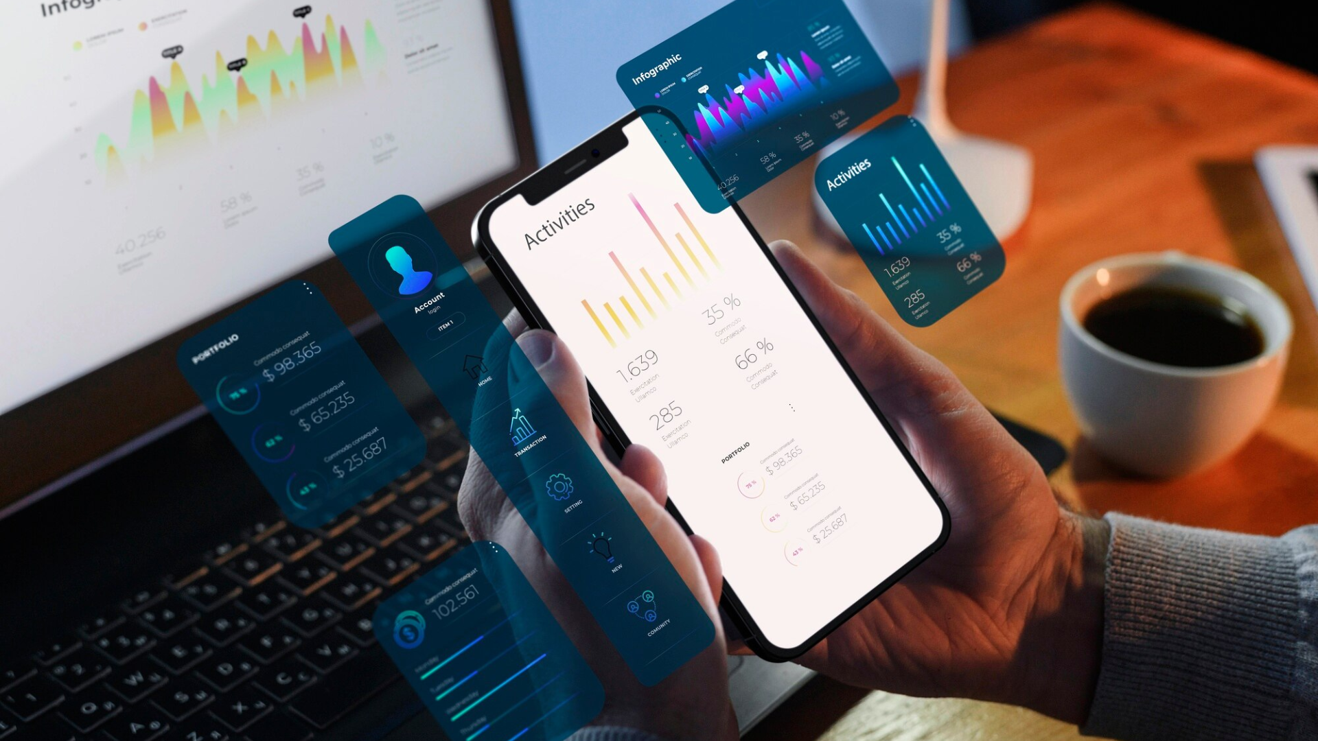
Responsive Mobile UI
Mobile-first design that adapts to any screen size. Smooth animations, intelligent loading states, and consistent experiences across devices.
Book a DemoKey Benefits
Works on Any Device
Whether you're using an iPhone SE or a Samsung Galaxy Note, the interface adapts perfectly
Fast & Responsive
Instant feedback to every tap. No lag, no delays, no frustration with unresponsive buttons
Consistent Experience
You know where to find things whether you're on your phone or a tablet
Beautiful Animations
Smooth transitions and animations make the interface feel polished and professional
Smart Loading States
When something is loading, you see progress indicators instead of confusion
Touch-Optimised
Large touch targets and appropriate spacing make everything easy to tap accurately
Battery Efficient
Efficient code means less CPU usage and longer battery life throughout your shift
Offline Responsive
Fast, responsive interface even when connectivity is limited or offline
How It Works
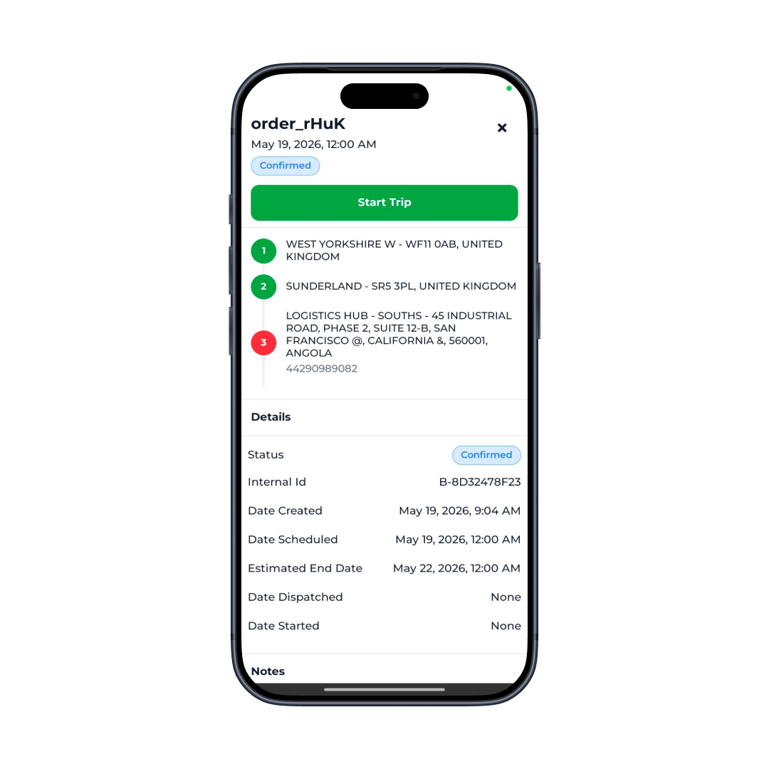
Open the App
The interface loads and displays immediately, sized perfectly for your device screen.
Navigate Naturally
Tap buttons, swipe between screens, scroll lists-all interactions feel intuitive and responsive.
See Progress
When something is loading or processing, appropriate progress indicators show what's happening.
Adapt to Rotation
If you rotate your phone from portrait to landscape, the layout adapts perfectly to the new orientation.
Core Capabilities
Responsive design adapting to all screen sizes (5" to 7"+)
Both portrait and landscape orientation support
Touch-optimised interface with large tap targets
Smooth page transitions and navigation animations
Loading spinners, progress bars, and skeleton screens
Optimised list rendering for performance
Image lazy-loading to reduce bandwidth
Reusable component library for consistency
Master Responsive Mobile UI
Mobile-first design that adapts to any screen size. Smooth animations, intelligent loading states, and consistent experiences across devices.
Real-World Use Cases
Various Device Populations
Fleet teams using a mix of iPhone and Android devices, various screen sizes, all work identically
One-Handed Operation
Delivery drivers need one-handed use while carrying packages-large touch targets make this practical
Outdoor Use
In bright sunlight, responsive interfaces with good contrast and fast feedback remain usable
Landscape Tablets
Drivers using tablets mounted in vehicles need optimised landscape layouts
Low-Bandwidth Conditions
Efficient rendering and lazy-loading ensure the app works on slower 3G connections
Extended Sessions
Optimised animations and efficient code ensure the app remains snappy even during 8+ hour shifts
Diverse Users
New to smartphones and tech-savvy drivers all find the interface intuitive
Field Conditions
Works reliably in moving vehicles, outdoor environments, and less-than-ideal conditions
Why Choose Responsive Mobile UI
Design that prioritises field operations is fundamentally different from design optimised for office use. Field workers need large touch targets they can hit while moving. Office workers can use tiny buttons with a mouse.
Our interface is designed for your reality. Large buttons, clear hierarchies, and obvious actions. When you're tired at the end of a long shift, you still know exactly what to tap and where to swipe.
The responsiveness is equally important. Every interaction should feel instant. When you tap "Mark Delivered," that button should depress immediately. Sluggish interfaces frustrate drivers and slow operations. Our carefully optimised codebase ensures zero lag.
Integration & Compatibility
React Native Framework
Cross-platform performance optimisation
NativeWind
Responsive design system with Tailwind CSS
React Navigation
Smooth screen transitions and gesture handling
FlatList & VirtualList
Efficient rendering of long lists
Image Cache
Smart image caching and lazy loading
Safe Area Handling
Adapts to notches and irregular screen shapes
Accessibility APIs
Full accessibility support on both platforms
Performance Monitoring
Continuous optimisation and monitoring
Ready to transform your operations?
Experience Responsive Mobile UI and discover how it can streamline your responsive mobile ui workflow.
Book a Demo